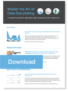
These days, companies are swallowing constellations of raw data. That’s good news for modern marketers because in the right hands, data is a powerful tool for visualizing marketing ROI. Easily said, but where do you start? Spark lines and heat maps? Bubble charts and bullet graphs? Scatter plots, histograms, or a touch of box-and-whisker? Yes, it can be daunting, but matching data with the right visualizations is critical to telling your story.
The key is knowing which data supports your story, and choosing the best visualizations to tell it. For example, area charts excel at revealing long-term funding trends. Need a clear window on internal operations performance? Bullet graphs dramatically contrast actual and target numbers. Want your audience to instantly understand patterns, trends and variations across geographic regions? Filled maps provide all the details at a glance.
To help you obtain “master storyteller status,” we’ve developed a guide of visualization best practices to support marketers in choosing the right graphs for their data. Regularly used by the our clients across a range of industries, these visualization best practices have a proven record of success. Who knows what hidden triumphs you might uncover? To paraphrase Shakespeare, there just might be more things in your graphs, than are dreamt of in your data.
Using industry-leading data analysis and visualization tools, Relationship One enables marketing and sales organizations to understand the impact of their demand generation efforts and marketing spend. Learn more.


